For decades, audio equipment asked to be trusted, not seen.
It worked behind dark panels, metal cases, fabric grilles, and anonymous rectangles.
The message was simple:
The more serious the machine, the less it should reveal.
A good amplifier did not need to explain itself.
A good CD player did not need to show its mechanism.
A good speaker could hide its drivers behind a grille.
The user was expected to believe in the machine because of its specifications, weight, brand, and performance.

This way of thinking produced many excellent products.
It also produced a design language that became almost invisible through repetition:
The Black Box.
The black box was not a mistake.
In the history of audio, it had practical reasons. Metal enclosures helped protect internal components.
Dark panels reduced visual distraction. Standardized shapes made it easier to stack equipment in racks.
Professional studio gear influenced home audio, and seriousness became associated with restraint.
To many listeners, a quiet black rectangle suggested precision, stability, and technical confidence.
But a useful design language can become a limitation when the culture around it changes.
Today, music devices no longer live only in dedicated hi-fi racks.
They live on shelves, sideboards, work desks, bedside tables, glass consoles, and open living spaces.
They are seen from every angle.
They sit beside books, lamps, speakers, artwork, plants, and personal objects.
In that environment, a product cannot rely only on performance. It must also justify its presence.
A black box can be efficient.
But efficiency is not the same as connection.
The problem with the black box is not that it is simple. Simplicity can be beautiful.
The problem is that the black box often hides the very thing that makes music equipment fascinating:
movement, reading, signal, timing, structure, and transformation.
It turns the machine into an object that works, but does not communicate.
A user presses a button. Sound appears.
The result is clear, but the process is gone.
For serious audio engineering, the process matters. For emotional listening, the process matters even more.
The Problem with the Black Box
A music device is never just a container for sound. It is a physical interface between the listener and the recording.
Even when the final output is invisible pressure in the air, the path toward that sound is full of visible possibilities:
- A disc turning
- A display counting time
- A laser reading data
- A circuit board organizing signal flow
- A mechanism holding the medium in place
When all of this disappears behind an opaque shell, the listener loses a layer of involvement.
This does not mean every product should expose every component.
That would be visual noise, not design. But a product should decide what deserves to be visible.
It should reveal enough to help the user understand that the object has been considered.
In product and interface design, visual form shapes perception.
Nielsen Norman Group describes the aesthetic-usability effect as users’ tendency to perceive attractive products as more usable. This does not mean beauty can replace engineering.
It means form affects how people approach, trust, and emotionally accept a product.
Audio design should take this seriously.
A music device that is visually mute may still perform well, but it asks the user to relate only to its output. A more thoughtful object can create a richer relationship: one that includes sight, touch, placement, and anticipation.

Visible Engineering as Design Language
M1 was designed around a different question:
What happens if the machine does not hide its own logic?
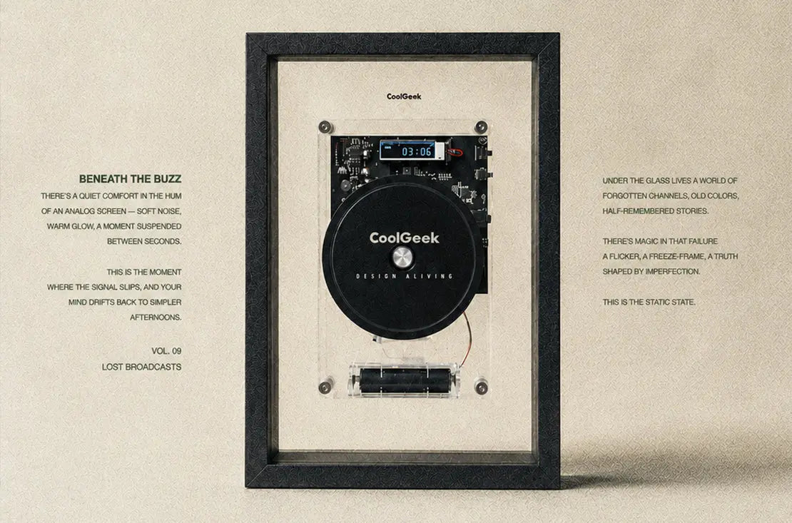
Instead of enclosing the CD mechanism inside a traditional box, M1 brings the structure forward. The:
- Exposed circuit board
- Transparent optical assembly
- Display window, disc position
- Screws, standoffs
- Removable battery holder
- Clear acrylic back panel
become part of the product’s visual language.
This is not decoration placed on top of engineering.
It is engineering arranged with visual intention.
A circuit board is not only a technical surface.
It can also become a graphic field. Components, traces, ports, and buttons form a kind of technical landscape.
A display is not only a readout.
It gives the object a sense of time. Screws and standoffs are not only fasteners.
When handled carefully, they create rhythm, order, and scale. The optical mechanism is not only functional. It becomes the mechanical center of the product.
This is where M1 separates itself from a typical consumer electronics shell.
Most black-box devices ask the enclosure to do the visual work while the engineering disappears inside.
M1 allows the engineering to become the visual work.
The frame does not hide the mechanism; it organizes it. The acrylic does not cover the product; it lets the product breathe.
According to the M1 user manual, the product supports CD, CD-R, and CD-RW playback, MP3 and WMA formats, Bluetooth connection, 3.5mm wired output, remote control operation, and a removable 18650 lithium battery. Those functions make it a usable music device.
The exposed structure makes those functions feel physically present.
That difference is important.
A device can be technically capable and still feel anonymous. M1 tries to make capability visible.

Transparency Is Not Decoration
Transparency in product design is often misunderstood.
It can easily become a gimmick:
a clear shell, a few exposed parts, a visual trick meant to look “techy.”
But real transparency is not about showing everything.
It is about revealing the right things with discipline.
The history of audio design already gives us a strong example.
Braun’s SK 4 radio-phonograph, often nicknamed “Snow White’s Coffin,” became iconic partly because of its white metal casing and transparent lid.
MoMA describes the product as having an elemental look that redefined the typology of domestic audio equipment.
That design was not powerful simply because it was see-through.
It was powerful because transparency changed the relationship between user, mechanism, and home.
The device no longer looked like a heavy furniture cabinet. It became lighter, clearer, and more architectural.
For M1, acrylic plays a similar conceptual role, but in a contemporary language.
The acrylic back panel creates depth. It lets light pass through the object.
It allows internal structures to appear suspended instead of buried.
It reduces the visual weight of the product, especially when placed in modern interiors with glass, metal, wood, fabric, and soft daylight.
It also makes the product easier to read:
frame, panel, board, mechanism, disc, display, and power structure each occupy a visible layer.

In this sense, acrylic is not just a material choice.
It is a way of making the product more honest.
The user can see that the machine is not a sealed mystery. It has parts.
It has layers. It has a logic. It has been assembled, aligned, and considered.
That visibility creates trust.
Not the kind of trust that comes from a specification sheet, but the kind that comes from looking at an object and feeling that someone cared about how it was made.
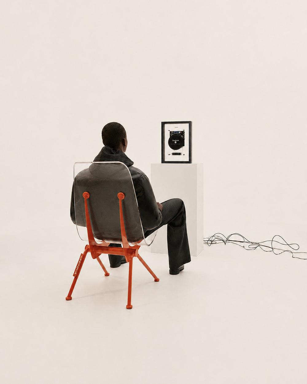
Black Frame, White Frame, Different Rooms
The frame is another key part of the design.
A frame changes how we read an object. A loose image feels temporary.
A framed image feels selected. A poster becomes part of a room when it is framed. A technical object can do the same.
M1 uses the frame to move the CD player away from the language of equipment and closer to the language of display.
The device is no longer simply placed in the room. It is composed for the room.
The black frame and white frame carry different spatial personalities.
The black frame creates contrast. It gives the product a sharper edge and a more gallery-like presence.
In a bright room, it acts almost like a visual punctuation mark. It suits spaces with darker speakers, metal shelving, records, and stronger graphic contrast.
The white frame creates calm. It feels lighter, softer, and more domestic.
In pale interiors, it reduces the sense of equipment and lets the mechanism appear more like a floating technical drawing.
It suits shelves, sideboards, bedrooms, and spaces where the product should be present but not heavy.

This is where color becomes more than color. It becomes spatial behavior.
Many audio products offer color options as surface variation. M1 uses black and white as two ways of entering the home.
One is more graphic.
One is more quiet.
Both preserve the same exposed structure, but they change the emotional distance between product and room.
That is why the frame is not simply an outer border.
It is the bridge between engineering and interior space.
When Function Loses Feeling
A common mistake in consumer electronics is assuming that better function automatically creates better experience.
It does not.
A device can have the right features and still feel forgettable.
It can connect quickly, play reliably, and measure well, yet never become part of the user’s daily rhythm.
This is especially true in audio, where the product exists not only to complete a task, but to support a mood.
Music is emotional by nature. The device that carries music should understand that.
The black box model often reduces audio equipment to a task machine:
Input → Processing → Output
It is efficient, but emotionally thin.
It hides the gestures that make listening feel intentional.
It removes the moment before playback.
It reduces the object to an endpoint.
A more expressive design can restore some of that feeling.
Not by adding unnecessary decoration. Not by making the product complicated.
But by allowing the right details to remain visible:
The medium, the mechanism, the display, the material layers, the hardware that holds everything together.
In M1, the visible structure is not there to shout.
It is there to slow the user down slightly.
To make the product worth looking at before pressing play.
To make the disc feel like it has a place.
To make the act of listening feel less automatic and more deliberate.
This is an important distinction.
The goal is not to make technology theatrical. The goal is to make it legible.
Making Listening Visible Again
Audio design has spent many years trying to perfect what we hear.
That work still matters. But the next question is not only how a product sounds.
It is also how it lives.
Does it disappear into a cabinet, or does it belong on a shelf?
Does it feel like equipment, or does it feel like an object chosen for the room?
Does it hide every sign of operation?
Does it let the listener witness the moment music begins?

M1 answers these questions through visible engineering.
It does not reject function.
It makes function more readable.
It does not expose everything.
It reveals enough.
It does not turn music into decoration.
It gives music a visible place.
That is why music devices should not be just black boxes.
Because sound may be invisible, but listening does not have to be.


Share:
Waarom we een cd-speler opnieuw hebben ontworpen: M1